Boost SEO with a Mobile Friendly Website Today

21 May 2025
Don’t lose clicks—Boost SEO with
a Mobile Friendly Website Today and convert more visitors.
The mobile revolution has
reshaped the digital landscape. Where once desktops ruled, today it's the
smartphone that commands attention—and conversions. If your website is not
mobile friendly, you are losing both user engagement and important search
traffic.
Mobile Optimization is no longer
a luxury; it's the standard. And in an era where speed, design, and user
experience drive everything, having a mobile friendly website isn't just
smart—it’s essential for survival.
The Mobile Revolution: Why
Clicks Are Happening on Phones
People aren’t waiting to get home
to Google something anymore. They search while commuting, queuing, or lounging
on the couch. More than 60% of worldwide online traffic currently originates
from mobile devices.
If your site doesn’t load fast,
look sharp, and function smoothly on a phone, users will bounce—and head
straight to a competitor who nailed their mobile experience.
How Google’s Mobile-First
Indexing Changed the Game
In 2018, Google flipped the
script. Instead of looking at the desktop version of your site first, it
started indexing mobile versions primarily. That means your mobile site now
determines your search engine ranking—even for desktop users.
Neglecting mobile is not just a
UX issue. It’s an SEO dealbreaker.
The Link Between Mobile
Friendliness and Higher Conversions
Mobile-friendly websites aren’t
just better for SEO—they’re better at selling. Clean, responsive layouts guide
users naturally to CTAs, reducing friction and increasing conversions.
A streamlined mobile experience
builds trust. It invites users to scroll, click, buy.
Understanding Mobile
Friendliness
What Does a Mobile Friendly
Website Really Mean?
A mobile friendly website adapts
to screen size, device orientation, and browser. It should function without
horizontal scrolling or zooming, with all buttons and menus easily accessible
by thumb.
It's more than just downsizing
the desktop version; it's about redesigning for smaller screens.
Responsive vs. Adaptive
Design: What’s Best for SEO?
Responsive design fluidly adjusts
content based on screen size, using the same HTML and URL. Adaptive design
loads different layouts for different devices.
While both can work, responsive
design is favored by Google for its simplicity and SEO compatibility.
Common Mobile Design Pitfalls
That Cost You Traffic
- Fonts too small to read
- Buttons too close together
- Pop-ups that block content
- Slow-loading images
These seemingly minor issues frustrate users—and search engines.
Why Mobile Optimization
Directly Impacts SEO
Google’s Mobile-First
Indexing: A Quick Breakdown
Your rating is determined by how
well your mobile site performs. If content, metadata, or links are missing on
mobile, Google won’t see them.
Consistency across mobile and
desktop is critical.
Page Experience Signals That
Affect Rankings
Google tests mobile usability,
loading speed, interactivity, and visual stability. These Core Web Vitals are
now part of its ranking algorithm.
If your mobile site fumbles here,
your visibility takes a hit.
Why Bounce Rates Go Up on
Unoptimized Mobile Sites
A non-mobile-friendly site is
hard to navigate, slow, and often glitchy. Visitors leave in seconds. High
bounce rates tell Google your site isn’t useful—so down your ranking goes.
The User Experience Factor
Designing for Fingers, Not
Mice
Mobile users tap, swipe, and
scroll. Make sure buttons are big enough, touch targets are spaced out, and
interactions feel smooth.
Friction-free = frustration-free.
Why Navigation Simplicity
Matters on Small Screens
On mobile, less is more.
Hamburger menus, sticky headers, and simplified pathways help users move
effortlessly. If they get lost, they leave.
Creating Clear CTAs That Users
Actually Click
Your CTA should pop. Utilize
contrasting colors, precise writing, and clever placement. One strong button
beats three weak ones.
Page Speed and Performance
Why Load Time is Crucial for
Mobile SEO
If your page takes longer than 3
seconds to load, over 50% of users bounce. Google doesn’t want to send people
to slow sites—and neither do users.
Best Practices for
Lightning-Fast Mobile Sites
- Use a content delivery network (CDN)
- Minify CSS and JavaScript
- Eliminate render-blocking resources
- Enable lazy loading for images
How to Compress Images Without
Killing Quality
Use next-gen formats like WebP.
Optimize images based on screen size. TinyPNG and ShortPixel are two tools that
can assist you minimize size while maintaining attractiveness.
Content Optimization for
Mobile Users
Writing for the Scroller:
Short, Punchy, and Clear
Mobile users skim. Use short
paragraphs, subheadings, bullet points, and bold text to guide the eye. Get to
the point fast.
Using Mobile-Friendly Fonts
and Readable Layouts
Sans-serif fonts, ample line
spacing, and text size above 16px are the sweet spot. Prioritize readability.
Optimizing Video and Media for
Mobile Consumption
Autoplay with muted sound,
captions for silent viewing, and compression are key. Don’t make users wait to
watch.
Technical SEO for Mobile
How to Audit Your Site for
Mobile SEO Issues
Use Google’s Mobile-Friendly Test
and Search Console. Look for usability errors, crawl issues, and slow load
times.
The Role of Mobile XML
Sitemaps and Canonical Tags
Make sure your sitemap includes
mobile URLs. Canonical tags should align across mobile and desktop to avoid
duplicate content confusion.
Avoiding Mobile Redirect Loops
and Crawl Errors
Incorrect redirects can trap
users—or worse, block bots. Always test your mobile site thoroughly across
devices.
Design and Development
Essentials
Using Mobile-First Design
Frameworks (like Bootstrap)
Start with the smallest screen
first, then scale up. Frameworks like Bootstrap make responsive design faster
and more reliable.
Touch-Friendly Forms and Input
Fields That Convert
Autofill, clear labels, and big
fields boost form completion on mobile. Remove unnecessary steps.
Including Map and
Click-to-Call Buttons for Local SEO
Make it simple for users to find
or get in touch with you. One tap should connect them.
Mobile UX and Conversion Rate
Optimization
How Micro-Interactions
Increase Mobile Engagement
Subtle animations, button
feedback, and swipes create a sense of control. It’s the small touches that
build connection.
A/B Testing Mobile Pages for
Better Results
Test headlines, images, CTA
placement, and forms. What works on desktop may flop on mobile.
Heatmaps and Session
Recordings: What Mobile Users Do
Tools like Hotjar reveal user
behavior. See where they drop off, what they click, and what they ignore.
Mobile SEO Tools You Should Be
Using
Google Mobile-Friendly Test
and PageSpeed Insights
These free tools offer insights
into usability and performance—straight from the source.
BrowserStack and Mobile
Emulator Tools
Test your site across dozens of
devices and screen sizes without owning them all.
Analytics Platforms for Mobile
Behavior Insights
Platforms like GA4, Mixpanel, or
Smartlook help you track mobile journeys and uncover hidden bottlenecks.
Case Studies and Real-World
Success
Brands That Boosted SEO with
Mobile Optimization
Discover how companies like
Airbnb and ASOS increased conversions by prioritizing mobile.
Before-and-After Mobile
Redesign Results
See real traffic boosts, bounce
rate drops, and sales growth post-redesign.
What We Can Learn from
Mobile-First Market Leaders
The fastest-growing brands design
for mobile first—and often mobile only.
eCommerce and Mobile SEO
Why Online Stores Need to
Optimize for Mobile
Mobile currently accounts for
more than 70% of eCommerce traffic. A clunky experience equals abandoned carts.
Mobile Product Page
Optimization for Search and Sales
Use high-quality images,
keyword-rich descriptions, and quick-loading carousels.
Mobile Checkout Flows That
Don’t Lose Customers
Streamline to as few steps as
possible. Enable guest checkout. Make errors easy to fix.
Local SEO and Mobile Searches
The Growth of Mobile
"Near Me" Searches
Users want immediate,
location-based results. Make sure your site is optimized for local intent.
Methods for Google Maps and
Local Pack Optimization
Claim your Google Business
Profile. Include local keywords, NAP info, and geo-tagged images.
Mobile Landing Pages That
Drive Foot Traffic
Focus on directions, store hours,
and immediate contact options. Think action over aesthetics.
Voice Search and Mobile SEO
How Voice Search Is Changing
Mobile Queries
Voice searches are longer and
more conversational. Optimize for natural language.
Structuring Content to Capture
Voice Search Traffic
Use question-based headers, quick
answers, and structured data for better visibility.
Optimizing for Featured
Snippets on Mobile
Concise, bullet-point answers can
win the top spot—especially on mobile where screen space is limited.
Common Mistakes That Hurt
Mobile SEO
Overloading with Pop-Ups and
Interstitials
Google penalizes intrusive
interstitials. Prioritize user experience over pushy promotions.
Ignoring Tablet Optimization
Tablet users still matter. Don’t
leave them behind in the design process.
Forgetting to Test Across
Multiple Devices
A site that works on iPhone 14
may not on Galaxy S10. Test often. Test wide.
Security and Mobile SEO
Why HTTPS Is a Mobile Ranking
Signal
Secure sites build trust.
Browsers now flag non-HTTPS pages as unsafe—especially on mobile.
Avoiding Mixed Content
Warnings on Mobile Browsers
Ensure all assets (images,
scripts, etc.) load over HTTPS. Inconsistencies lead to user drop-off.
Securing User Data in Mobile
Contact Forms
Use encryption, clear privacy
policies, and minimal data collection. Mobile users are cautious.
Tracking and Measuring Mobile
SEO Success
Key Metrics to Watch in GA4
for Mobile SEO
Monitor mobile traffic, session
duration, bounce rate, and conversion paths.
Monitoring Mobile Conversion
Rates Separately
Desktop and mobile behave
differently. Analyze them independently for true insights.
Using Google Search Console’s
Mobile Usability Report
Identify and fix errors like
clickable elements too close together, viewport issues, and content overflow.
Preparing for the Future of
Mobile SEO
The Role of AI in Mobile
Search and Personalization
Search results are becoming more
intuitive. Personalization powered by AI customizes content for every user.
Progressive Web Apps (PWAs)
and SEO Potential
PWAs load fast, work offline, and
mimic apps. They provide significant UX and SEO benefits.
Staying Ahead of Google’s
Mobile Algorithm Updates
Stay informed, agile, and ready
to adapt. Google’s updates are inevitable—don’t let them catch you off guard.
The Mobile SEO Checklist
Daily Tasks to Keep Mobile
Performance Sharp
- Check site speed
- Scan for errors
- Monitor uptime
Weekly Checks to Catch Issues
Early
- Review analytics
- Test forms
- Validate structured data
Monthly Audits to Stay
Competitive
- Full mobile usability review
- Keyword performance
- Competitor benchmarking
Conclusion
Why Mobile SEO Is No Longer
Optional
The world has gone mobile. So
must your website. It’s not just about ranking—it’s about reaching real people
where they actually are.
The Power of Mobile to Drive
Clicks, Conversions, and Growth
A well-optimized mobile site
isn't just functional. It’s persuasive. It guides, it sells, it builds trust.
Start Today: Make Your Website
Work Smarter on Every Screen
The time to act isn’t tomorrow.
It’s now. Your mobile-friendly website is the gateway to visibility, traffic,
and lasting growth. Don’t lose another click.
Recent Articles
-
 Want more local traffic? These Local SEO Tips to Rank Higher on Google will get you noticed
-
 What's the Difference Between on-page and off-page SEO?
-
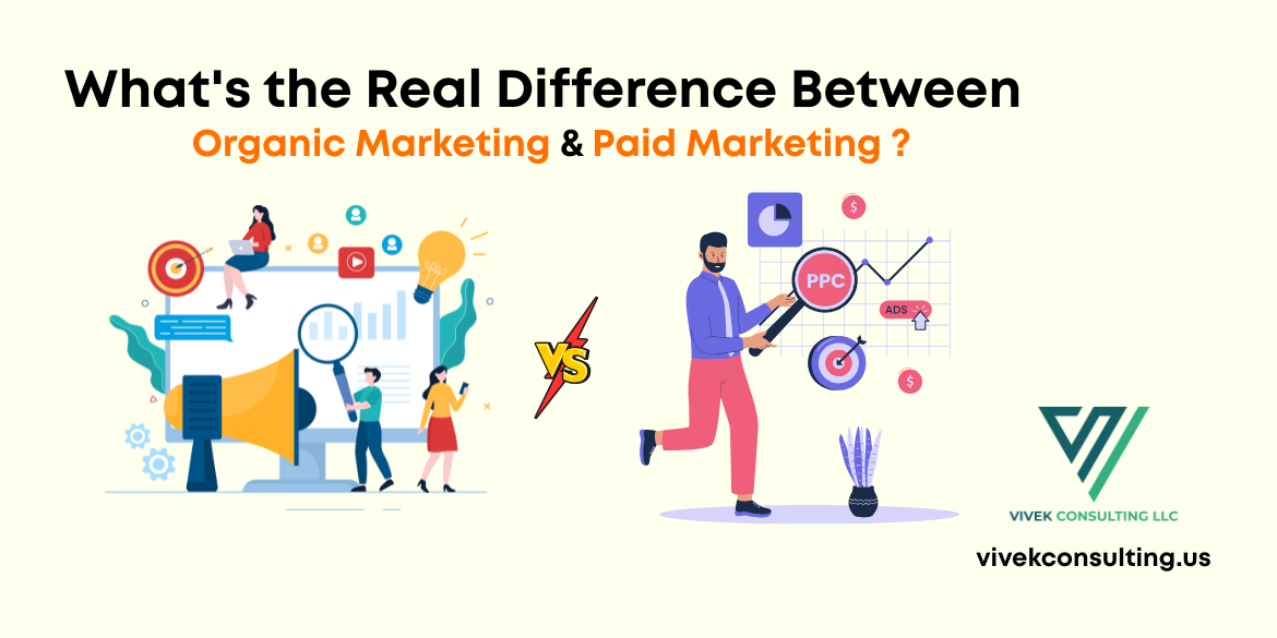 What's the Real Difference Between Organic and Paid Digital Marketing?
-
Boost SEO with a Mobile Friendly Website Today
-
 How to Change the Theme on Shopify Without Using Any Code
-
 Why Businesses Need Blockchain Development
-
 SEO Strategy: How to Create an Effective Plan
-
 2025 Digital Marketing Trends and Predictions
-
 The Future of Marketing with Meta Application
-
 Keyword Research for Website Wins in 2025 [Top 10 Free Keyword Research Tools]
-
.png) Learning the SEO Audit Checklist. Every website should rank higher, load faster, and convert better without wasting time.
Learning the SEO Audit Checklist. Every website should rank higher, load faster, and convert better without wasting time.
-
 Ready for serious growth? Outsource services to scale your business fast and save time and money.
-
 From AI to no-code, explore the Web Development Trends You Need to Know right now.
-
 Supercharge Business Growth with SEO
-
 Digital Marketing Trends You Cannot Ignore in 2025
-
 Master Digital Marketing with AI in 2025
-
 How AI Is Changing Software Development
-
 Mobile Application Development in 10 Easy Steps
-
 Outsource Services to Boost Efficiency
-
 Ready to scale smart? Boost efficiency fast with managed services that work.
-
 Outsource Services: The Smart Move for Your Business
-
 Technical SEO Tactics to Skyrocket Your Rankings
-
 The digital world is evolving fast. Here is the web development trends you can’t ignore if you want to stay competitive.
-
 Want more traffic? These off-page SEO tips will help you rank higher and grow like a pro! ????
-
 The Role of AI in Modern Software Development
-
 Boost Organic Traffic Through On-Page SEO Strategies
-
 How SEO Can Skyrocket Your Business Growth
-
.png) Why Digital Marketing Benefits Business Success in Charlotte NC
Why Digital Marketing Benefits Business Success in Charlotte NC
-
 Explore the future of smartphone application development with Vivek Consulting and stay ahead of the game.
-
 Crush Your Competition with Digital Marketing Charlotte NC - Vivek consulting
-
 Why Vivek Consulting Tops Charlotte’s Software Developers
-
 The Innovation of Smart and Inclusive UX: How AI and 5G Are Transforming Mobile Application Development
-
 Website Development: The Value of Web Design in Establishing a Powerful Online Presence
-
 Elevate Your Brand: Discover the Top Marketing Agency in Charlotte for 2025 - Vivek consulting